When I start a new block, I usually do some research to see how other people constructed the block, as well as how it looked in the original quilt from the 1860s. Often I follow what others have done, but sometimes it makes more sense to me to alter some part of the construction process.
It seems like lately I’ve been constantly eliminating seams in my blocks. In fact, on the last block I made, which was very similar in style to this one, I opted to remove the seams in the center shape entirely. This was primarily because I was using fabric with a semi-large print and didn’t want the design on the fabric to look all chopped up at the seams.
In this latest block, however, I decided – for a change – that I wanted to keep all of the suggested seams. The reason? Fabric print again. This time, instead of having a semi-large print, I had a small directional print. For those not in the know, a directional print is one where the design elements (flowers or polka dots or whatever) are not just randomly scattered on the fabric. They are oriented in a specific direction, so the design looks different if you view it at different angles. Stripes are a good example of this – if you have vertical stripes and rotate the fabric 90 degrees, then you have horizontal stripes.
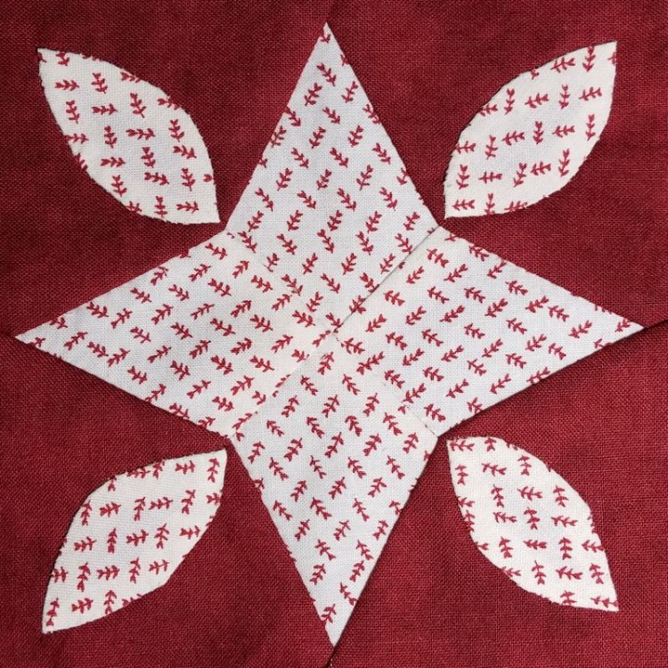
At first glance, my chosen fabric looks random, but when you look more closely, you can see that while the little red flower sprigs are angled slightly to one side or the other, they are all pointing essentially the same direction. Each one has a little heart-shaped flower on one end, and each of those flowers is pointing more or less to the same edge of the fabric. Arranged the way they are, those tiny flower sprigs are practically stripes.
Since the print is small, I wasn’t too worried about it looking chopped up, but I figured I could use its directional nature to get a neat effect, by having the fabric design on different pieces point in different directions. The center piece is star-shaped, and I thought it would be neat to have it look like the fabric print was radiating out from the center of the star.
When I cut out the pieces for this block, I made sure the heart-shaped flowers were pointing to the pointy end of each of those four center star pieces. Similarly, when I stitched on the leaf shapes, I made sure they were all stitched with the heart-shaped flowers pointing towards the corners of the block.
Two of the leaf shapes were stitched on while waiting with a family member at the emergency room, so they may look a little lumpy, but they served their purpose of keeping me calm. The good news is that I didn’t lose any leaf shapes this time … I still haven’t found the missing ones from the last block.
The differences between these two seemingly similar blocks don’t end with fabric placement or leaf loss, though. The sewing technique was different too. On the previous block, the center shape was appliquéd on the background fabric. On this block, the center shape is stitched to four odd-shaped red corner pieces, using Y-seams. I’m a big fan of this plan, since it uses less red fabric (and also because I am not a fan of appliqué).
These two blocks prove that there’s no one right way to create your Dear Jane blocks. So, make exceptions to the rules (or break them entirely) and choose the construction techniques that work for you, your fabric, and the particular block you’re working on.
