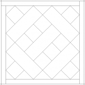
Somehow I was not expecting this block to look the way it did. It always fascinates me how different a block looks in a black and white drawing. Take the block featured in this post, for example:

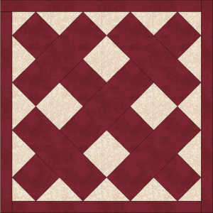
What jumped out at me in this line drawing were two barbells, crossed in an X formation. Based on this drawing, I thought the block was going to look like this:

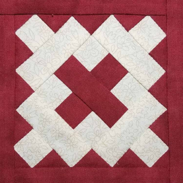
Even after looking at a color photo of the block in the original quilt, I still couldn’t quite make the connection in my brain between my imaginary “crossed barbells” block and the actual “postage stamp with an X” block – even though they both use the exact same pieces in the exact same configuration.
The placement of color in the block makes all the difference. When you have two pieces of the same fabric next to each other, the seam between them almost disappears and the two pieces are merged together into a new shape. Thus, the color choices can change barbells into stamps. On a project that I’m designing myself, I love this kind of block. The possibilities are endless, based on the color placement.
However, this quilt had two layers of tradition built into the pattern (Jane Stickle’s original design, plus my self-imposed need to stay true to Paulette’s vision), and I felt like I needed to conform to the original layout for this block.
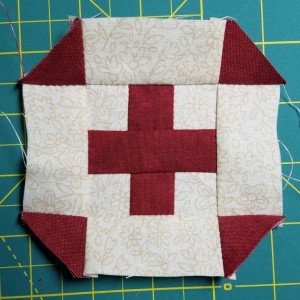
So, I cut out the pieces in the colors indicated, and set to work stitching them together. Halfway through, I still wasn’t seeing how it was going to turn into a block resembling the one in the original quilt.

Granted, the above photo of the block in progress is rotated 45 degrees, but I still struggled to connect this snippet with the postage stamp I’d been promised. It wasn’t until all the adjacent tan flowered pieces were attached (and visually merged into one giant postage stamp shape by my brain) that the block finally started to look right.
However, when I went to “color in” this block for the image on the Progress page, I was right back at those darn crossed barbells again. I had to put the completed block in front of me as a reference in order to get the colors right on the progress image. The lure of those barbells sure is strong for me. It’s like a Rorschach test, where everyone sees something slightly different in the line drawing.
Although I sometimes like to put a quirky twist on a block (like fussy cutting to create a certain effect), at heart I guess I’m a traditionalist. I couldn’t bring myself to make a major design change like swapping out Jane’s postage stamp for the barbells in my version of the block.
How true do you like to stay to whatever quilt pattern you’re working with?
